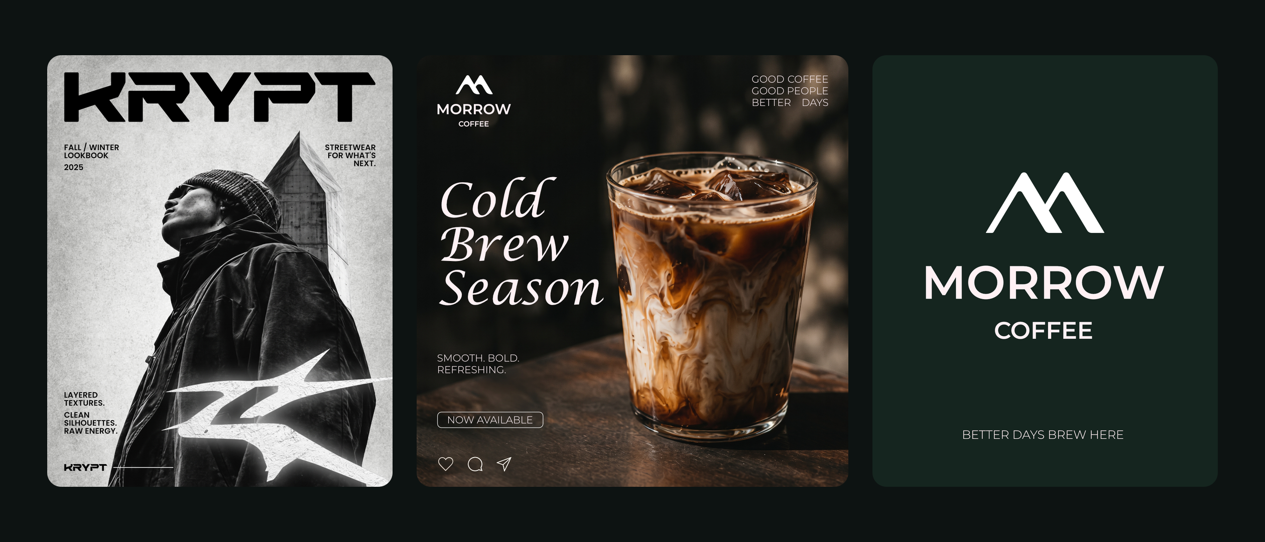
Morrow Coffee & Krypt brand identities
- Client
- Studio concept work: Morrow Coffee and Krypt
- Scope
- Brand strategy & positioning
- Logo & visual identity
- Typography & colour systems
- Social campaign design
- Timeline
- September 2025, two identities
Logos are easy. Post twenty is where brands break.
Most small brands don't fall apart at the logo. They fall apart around post twenty, when the template runs out and every new graphic gets improvised from scratch. The feed stops looking like one business, and nobody remembers who posted what.
We wanted to show what a system looks like when it holds, so we set ourselves two briefs that pull in opposite directions. Morrow Coffee had to feel slow, warm and premium. Krypt had to feel loud, urgent and built for drop culture. Neither could borrow anything from the other.
Same process. Opposite brands.
For each brand we started with the same questions: who it's for, what it promises, and how it should sound. Then we turned the answers into a mark, a type pairing, a palette and a small set of layout rules, so any new post can be built from parts that already exist.
Morrow pairs a twin-peak monogram with a flowing italic serif and an open geometric sans on deep forest green. The brand line is “Better days brew here.” Krypt pairs a squared, angular wordmark and a distressed star emblem with heavy textured display type and grayscale photography. One brush stroke of green is held back for the moments that should hit hardest.
Morrow Coffee. Better days brew here.
A specialty café brand built on restraint: a deep green field, a twin-peak monogram, and an italic serif that does the talking.
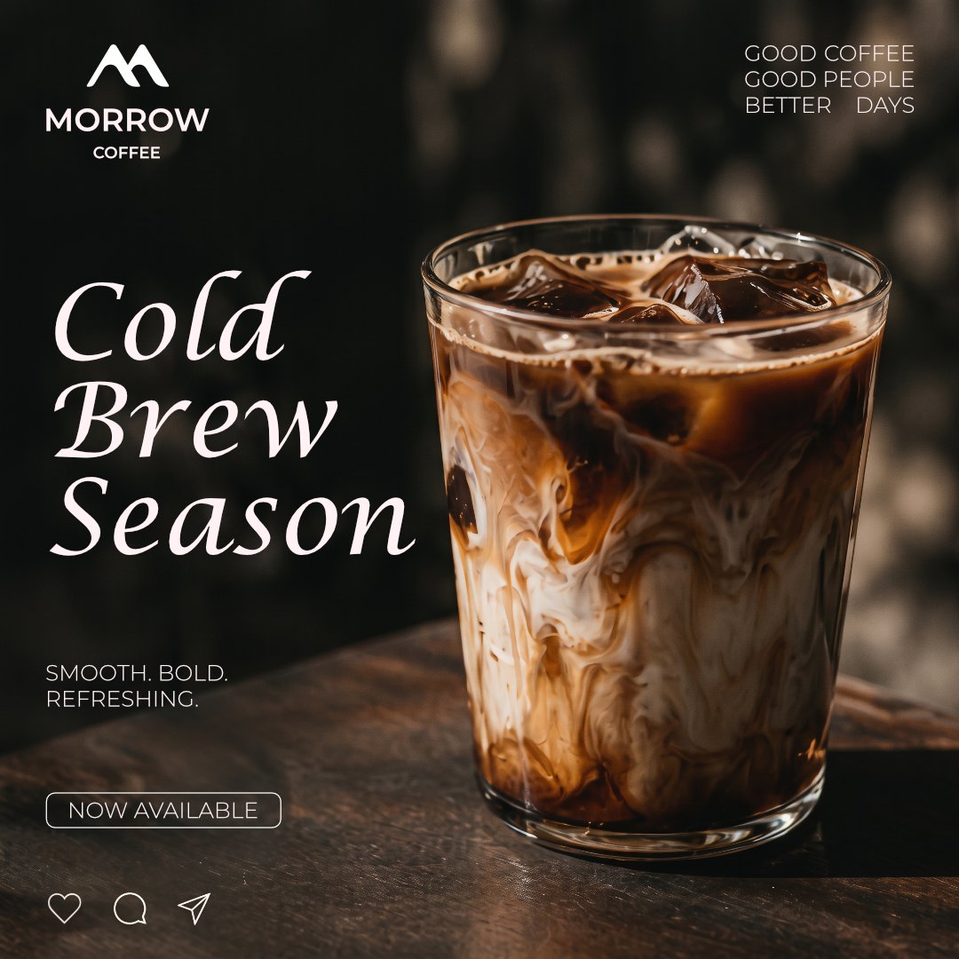
Cold Brew SeasonLaunch post 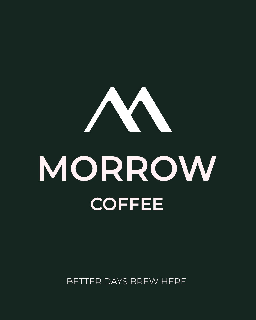
Primary lockupLogo 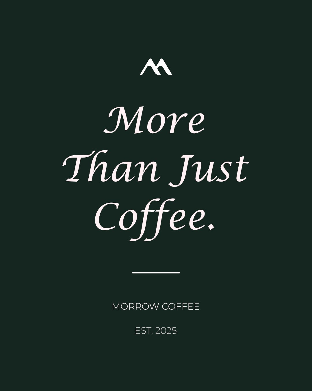
More Than Just CoffeeBrand post
Krypt. Streetwear for what's next.
A streetwear label built for drops: an angular wordmark, a distressed star emblem, grayscale concrete, and type that looks like it was sprayed on.
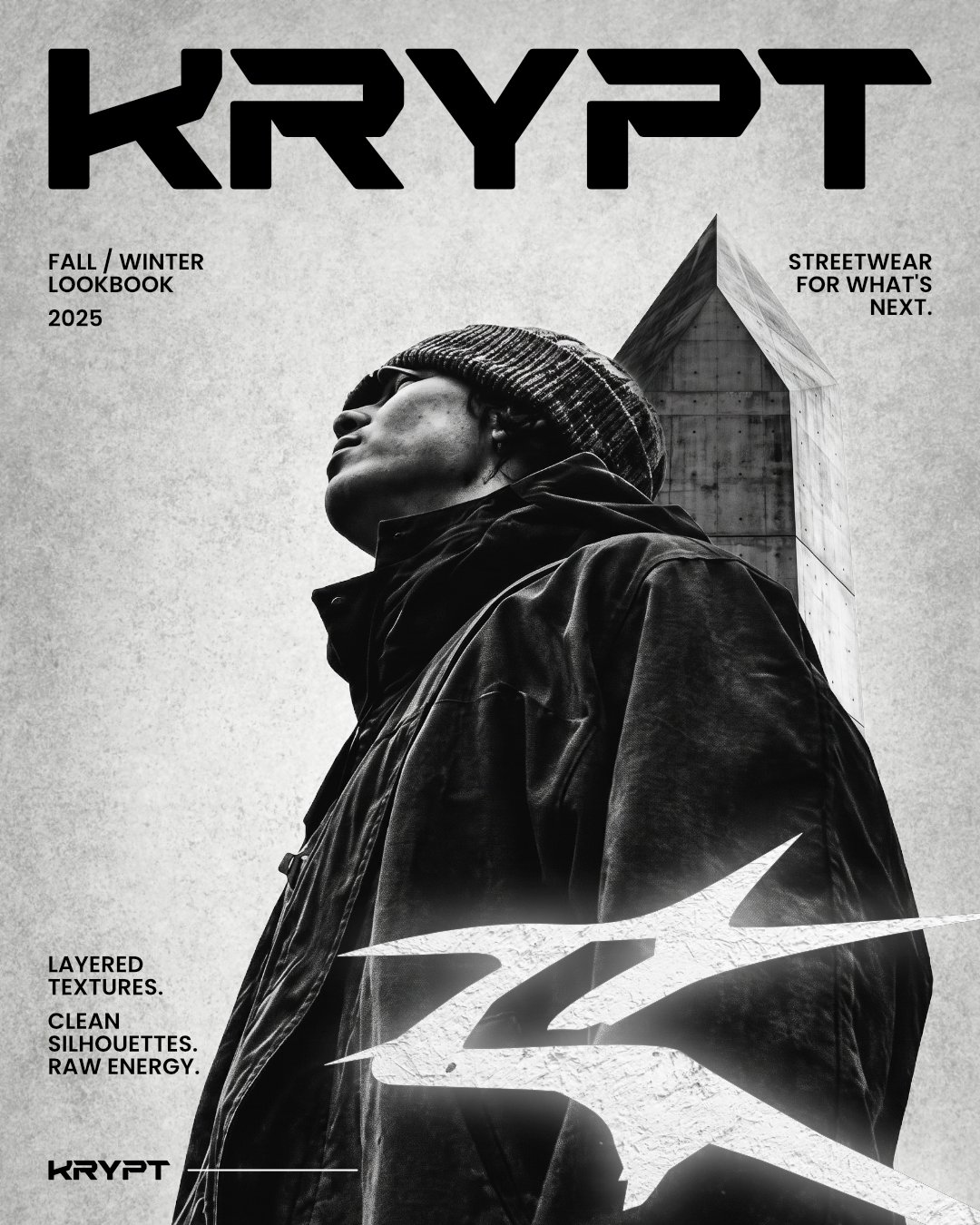
Fall / Winter lookbookLookbook cover 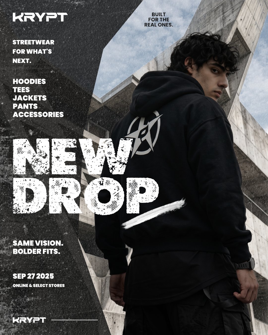
New DropLaunch poster 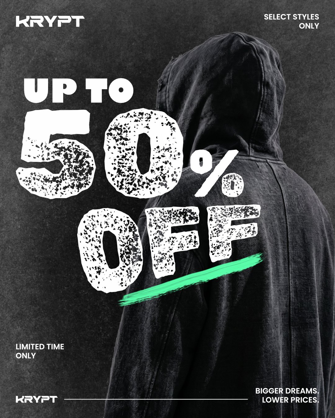
Up to 50% offSale poster
Identity highlights. The decisions that make each brand hold.
A monogram that works at every size
Morrow's twin peaks read as an M and as a horizon. That covers the name and the promise of a better tomorrow in one shape, and it stays clear from a cup sleeve up to a storefront sign.
Two voices, set in type
Morrow uses an italic serif for its headlines and a light, open sans for everything else. Krypt uses heavy distressed display type with tight caps. Even without a logo, you can tell the brands apart from the type alone.
A mark built for merch
Krypt's star emblem is drawn to sit on the back of a hoodie as easily as on a poster. The angular wordmark is set up to run at full width on a lookbook cover or small in a footer signature.
A campaign kit, not one-off posts
Both brands have fixed corners for the logo, tagline and signature line, a few recurring formats (launch, brand post, sale), and one accent saved for emphasis. The next post can be built from the kit instead of designed from scratch.
Event highlight films and social reels for corporate launches, catering, cultural and community events.