WeezLab brand identity & design system
- Client
- WeezLab, in-house identity
- Scope
- Logo & logomark
- Colour & typography systems
- Brand pattern
- Signage & stationery
- Brand guidelines
- Timeline
- Living system, maintained in-house
We sell systems. So ours had to be one.
An agency that sells brand systems has to run on one. Our logo was in use across the website, proposals and social posts, but the rules behind it lived in people's heads: which teal, how much space, what goes on a dark background, which typeface for what.
We needed the identity written down as a system: something a designer, a developer or a print vendor could pick up and apply without asking, and something we could point clients to as an example of what they get.
Our initials, measured. Pointing up and to the right.
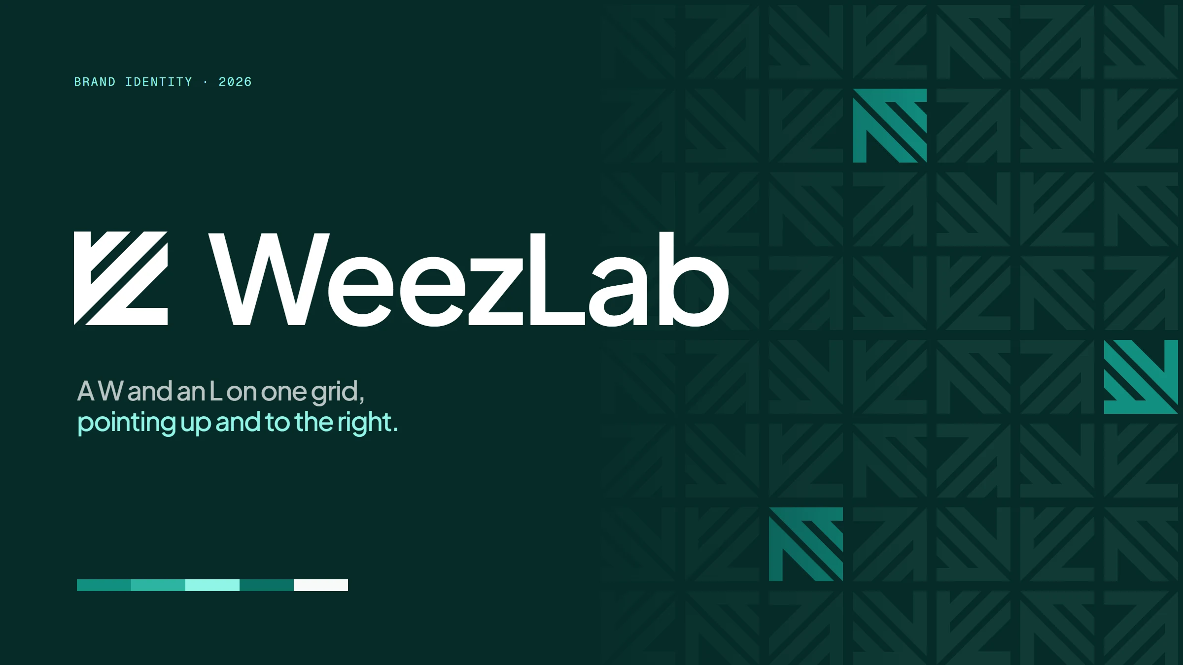
The mark is our initials, fitted together. The upper form is a W, a stem cut by two diagonal strokes. The lower form is an L, a base with one rising stroke. Fitted along a single diagonal, they close into a perfect square with nothing left over. It is drawn with three angles only, 0°, 45° and 90°, with no curves and nothing drawn by eye: every proportion comes from the width of the stem. That is the Lab in WeezLab, work that is measured rather than guessed at. And every cut runs the same way, from the bottom left to the top right, the direction growth goes. It is a mark about momentum, for a studio whose job is moving clients' numbers up and to the right.
From there the rules follow the mark. The stem width sets the clear space. The teal of the mark anchors a six-colour palette with mint as the one accent for dark surfaces. Tiling the mark in quarter turns produces the brand pattern. Plus Jakarta Sans sets headlines at a light weight with tight tracking, and Geist handles body text and interface.
The mark. Built to point up.
The primary lockup pairs the logomark with the wordmark in Plus Jakarta Sans. Clear space is measured from the mark itself: two stem widths on every side.
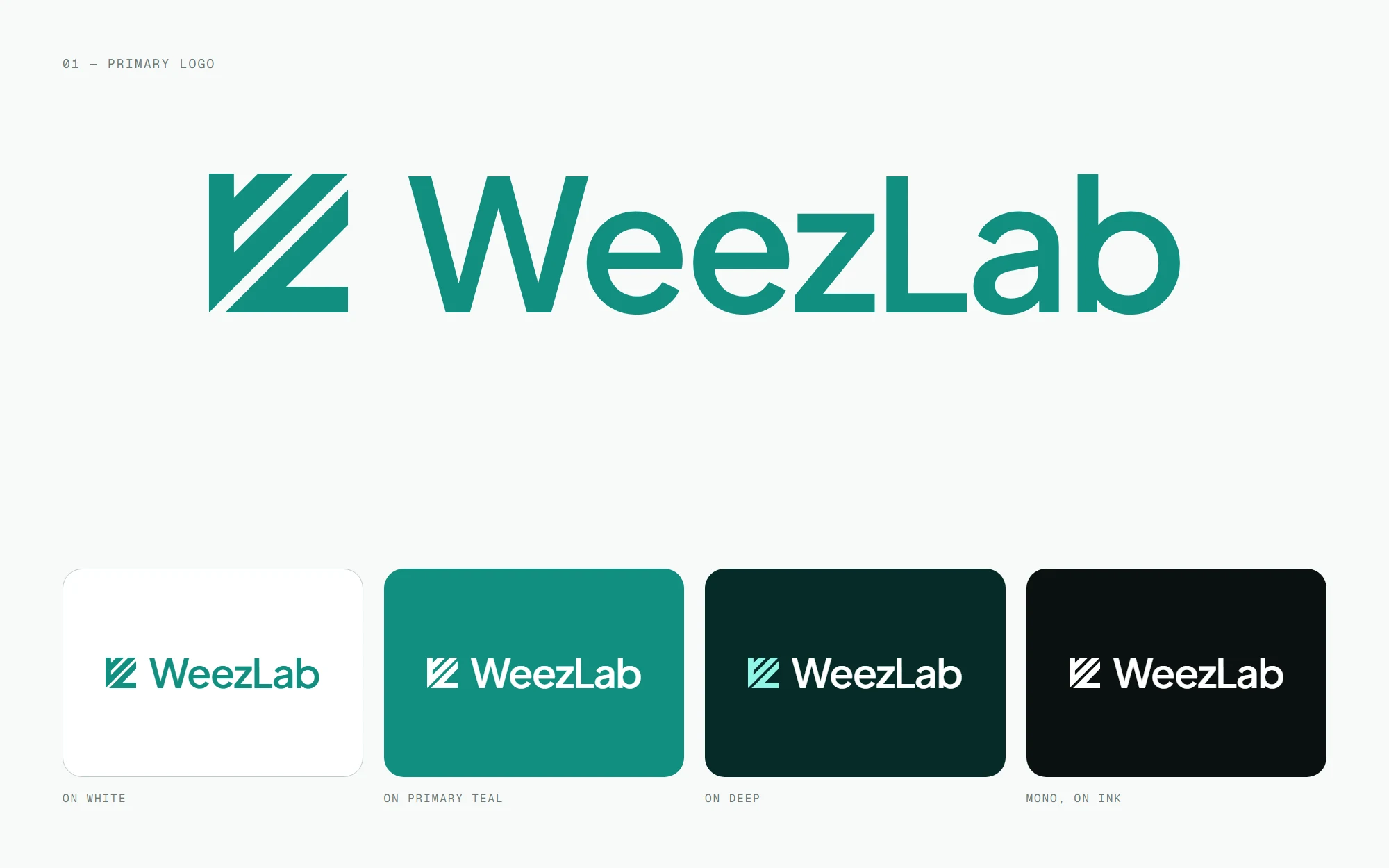
Primary logoLockup & colourways 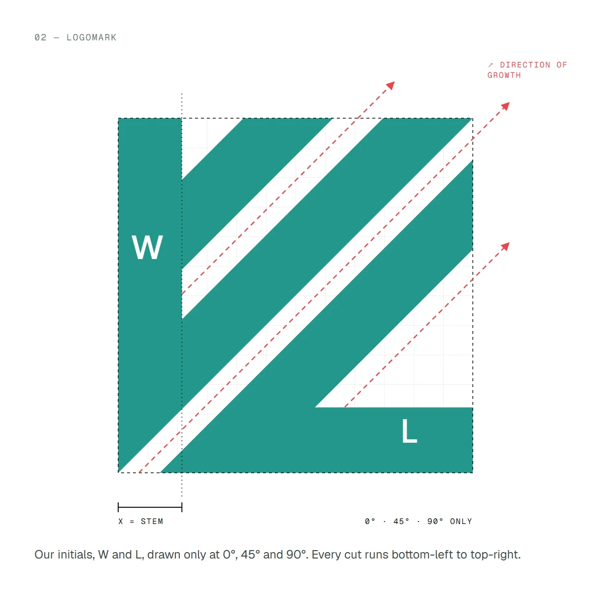
LogomarkConstruction 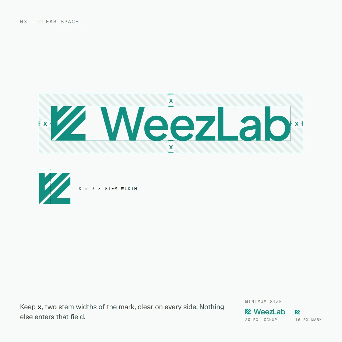
Clear spaceMinimum size
Colour, type & pattern. Parts that build everything else.
Six colours with one job each, two typefaces, and a pattern made from nothing but the mark turned in quarter steps.
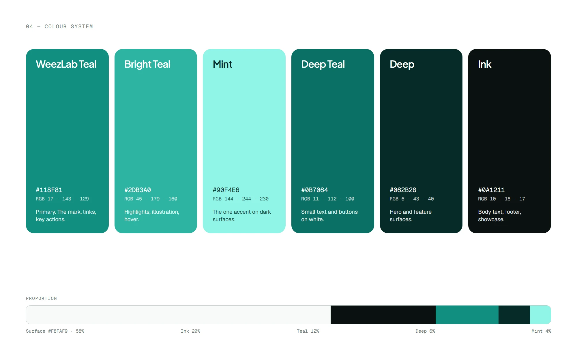
Colour systemSix colours 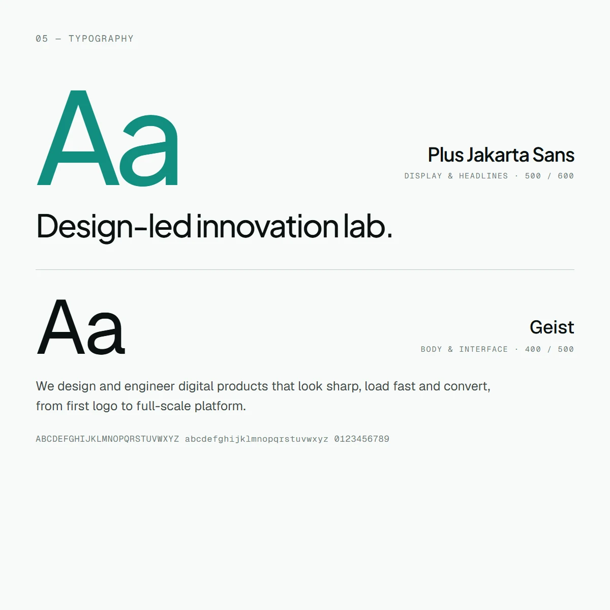
TypographyTwo typefaces 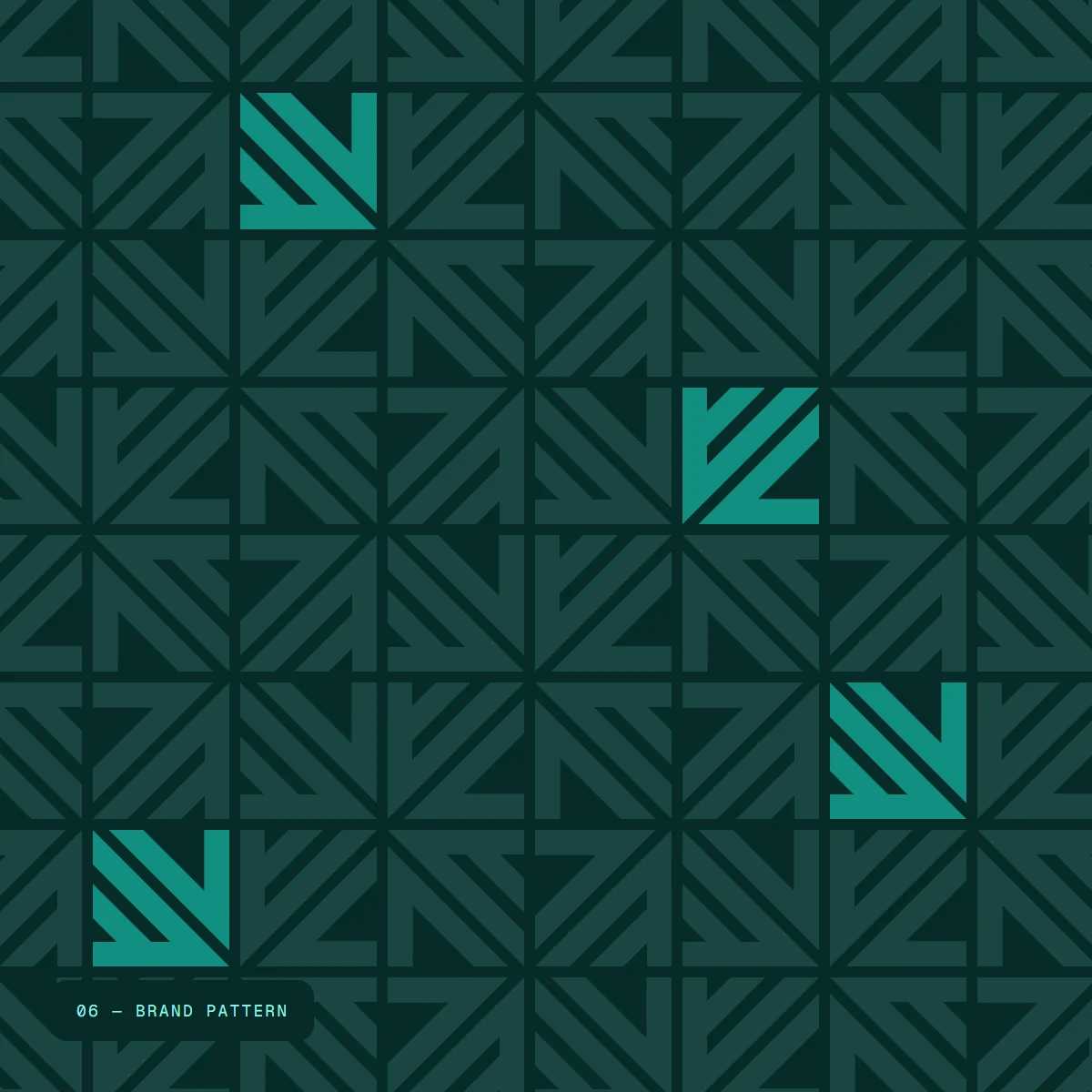
Brand patternThe mark, woven
Signage & stationery. The same rules, off screen.
A backlit wall sign on the pattern, a round blade sign that uses the mark alone, wayfinding, and a print set that keeps the teal edge and the pattern on the reverse.
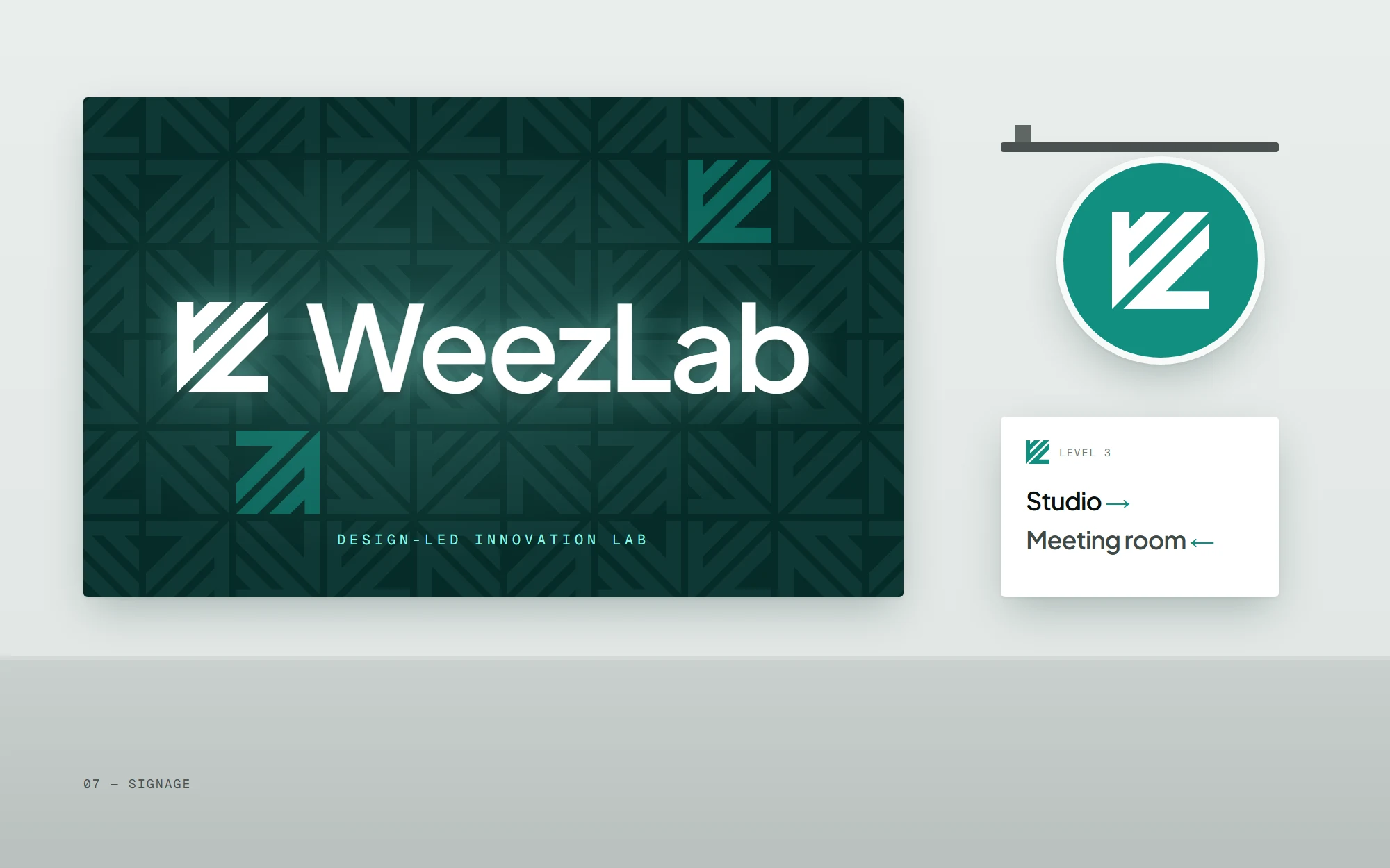
SignageWall, blade & wayfinding 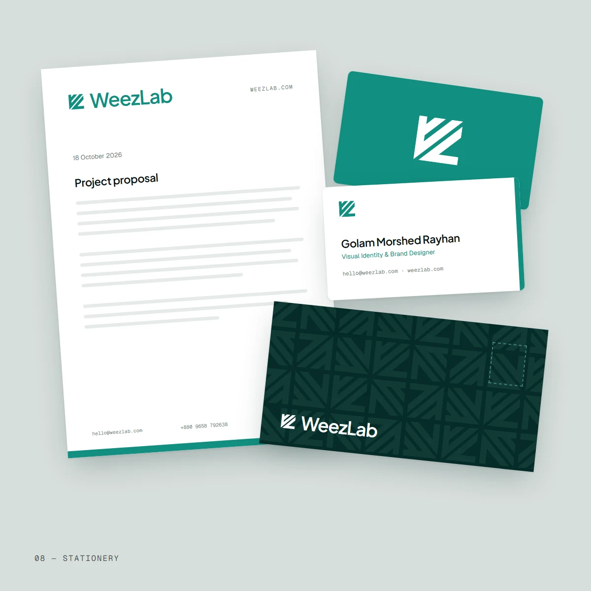
StationeryLetterhead & envelope 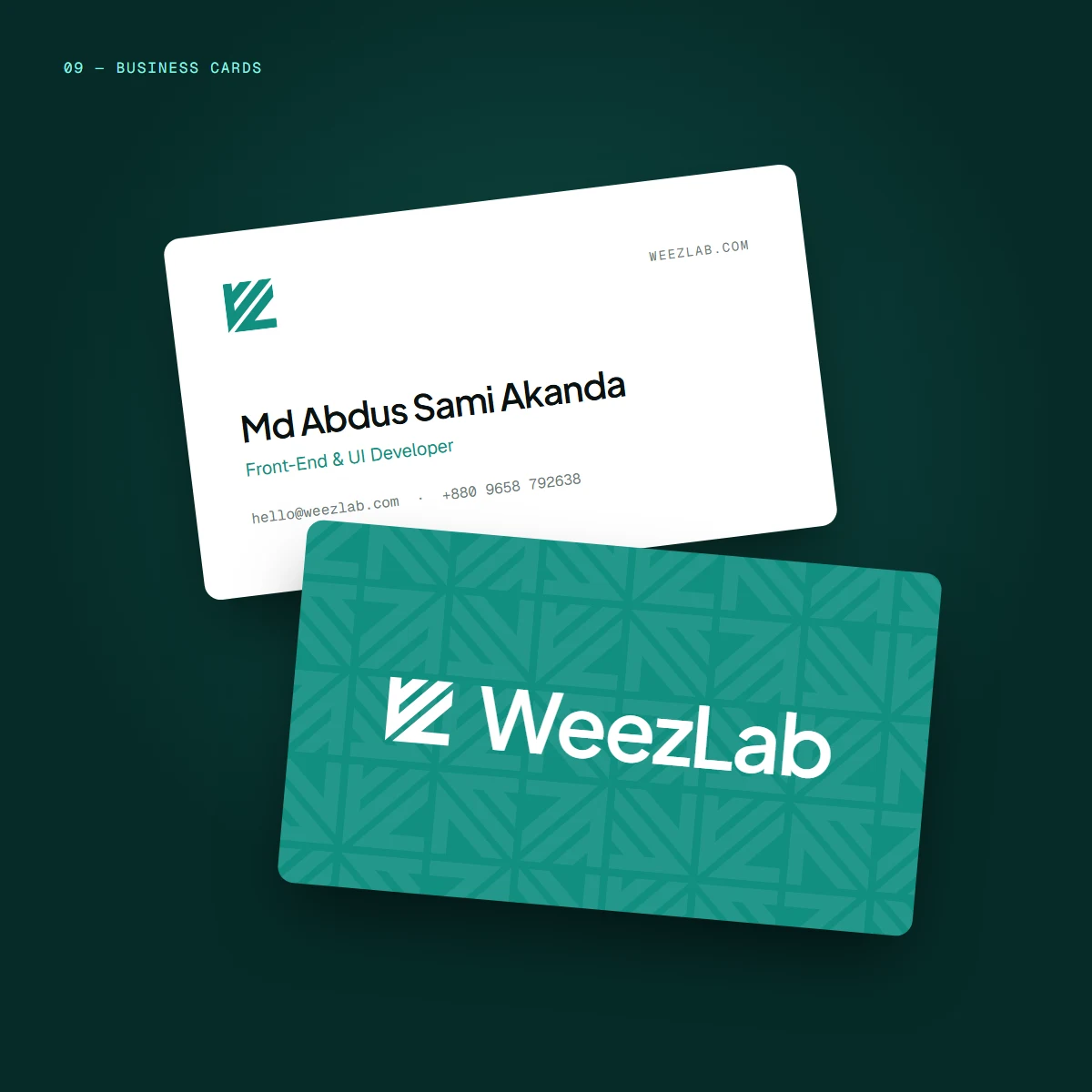
Business cardsFront & back
Brand mockups. From the studio to the feed.
The identity on merchandise, team badges and the places most people meet it first: a social profile and a feed post.
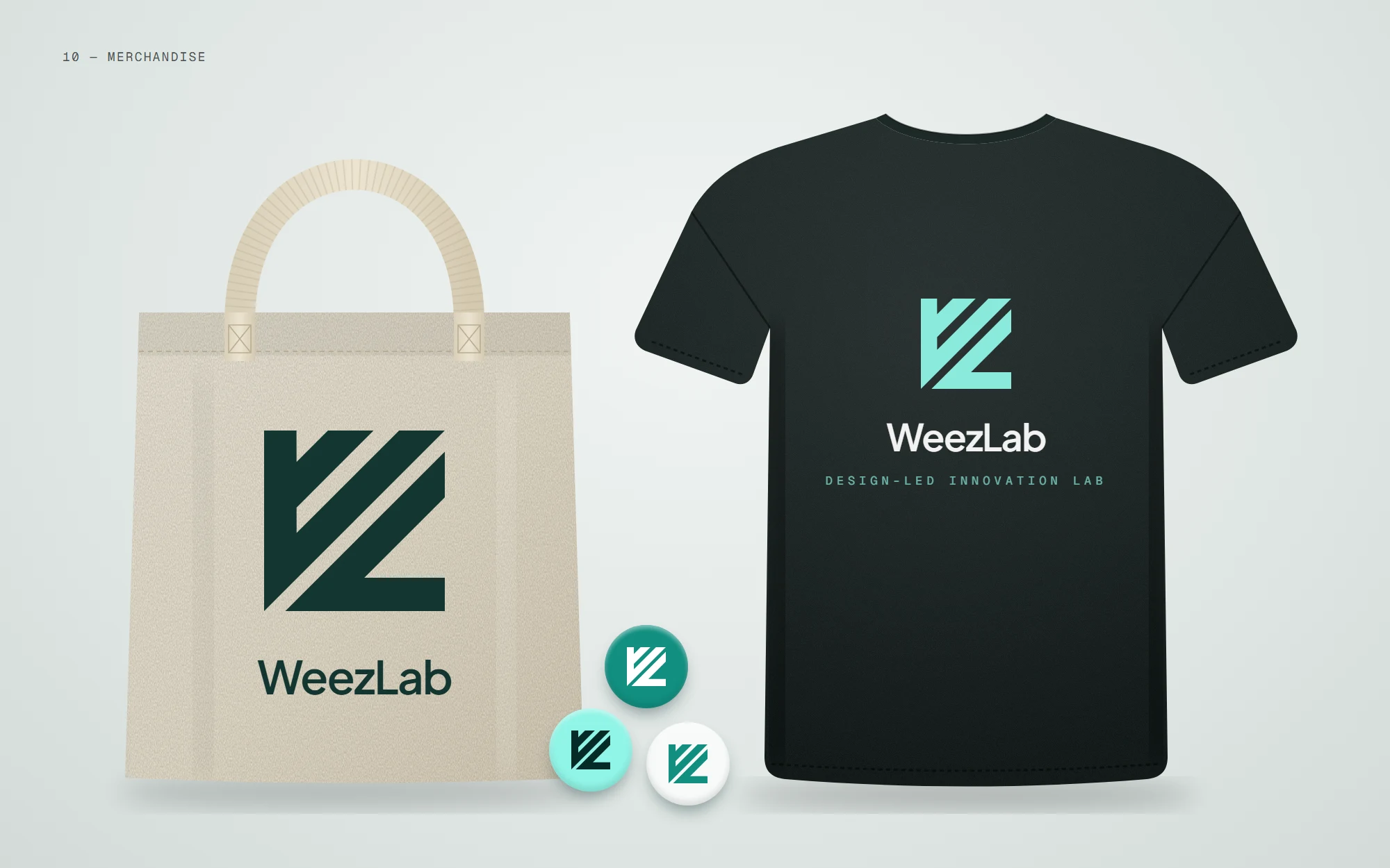
MerchandiseTote, tee & pins 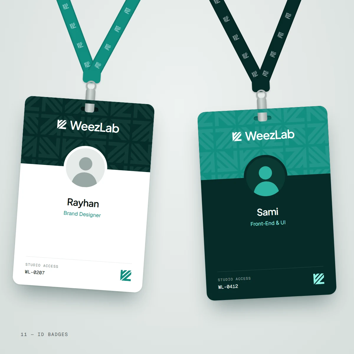
ID badgesTeam 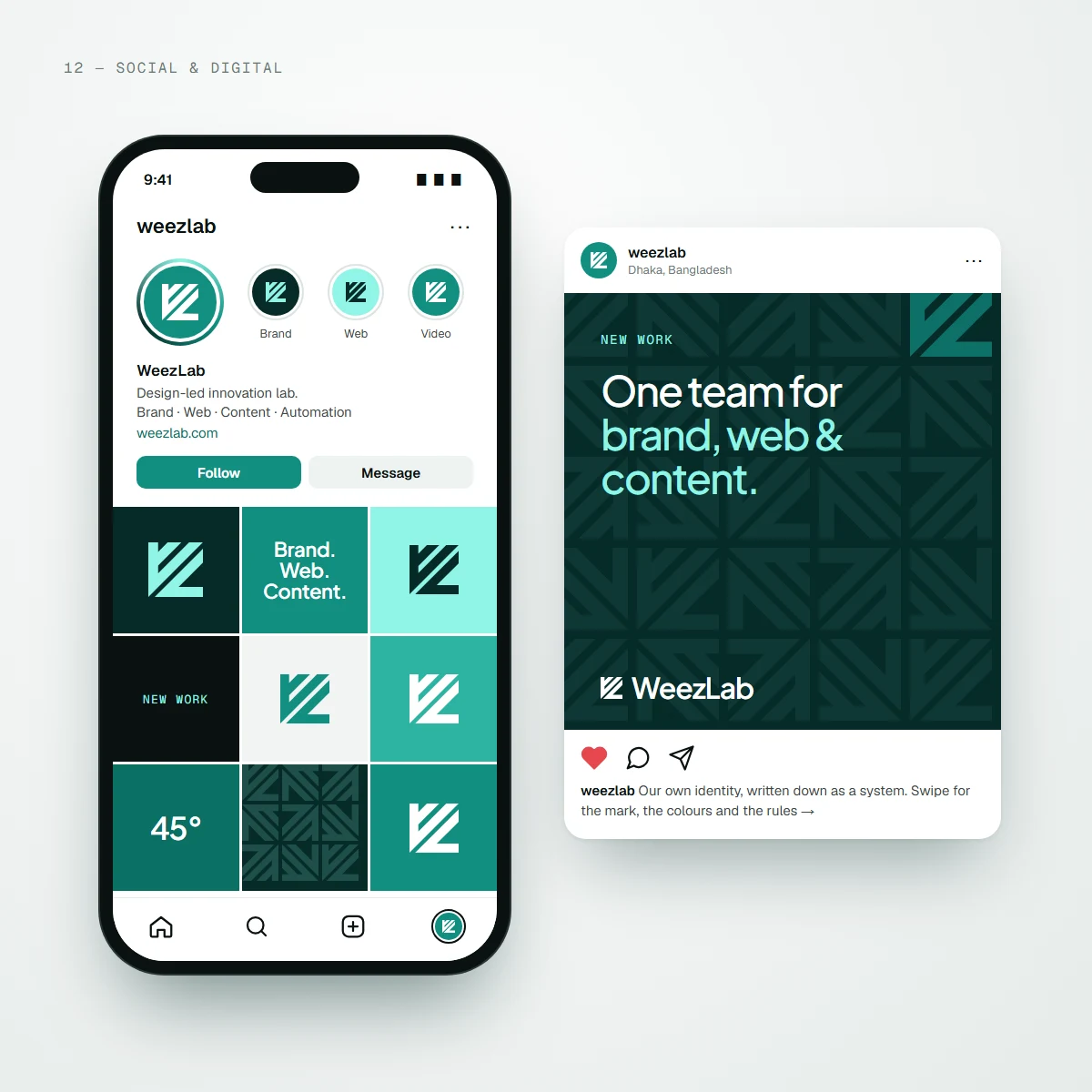
Social & digitalProfile & post
System highlights. The rules that keep it consistent.
Every rule is measured from the mark
Clear space is two stem widths, so it scales with the logo and never needs a separate measurement. The minimum sizes, 20 pixels for the lockup and 16 for the mark alone, are the smallest at which the white channel stays open.
Six colours, one accent
WeezLab Teal does the brand's work, Deep Teal passes contrast for small text on white, Deep and Ink carry the dark surfaces, and Mint is the single accent allowed on them. Each colour has one job, so nobody has to guess.
A pattern with nothing added
The pattern is the logomark tiled in quarter turns. Because every edge in the mark sits at 0°, 45° or 90°, the tiles lock into a continuous weave, and a few marks picked out in solid teal give it a focal point.
One system across screen and print
The same tokens drive the website's code and the print files: the hex values, the type scale and the teal edge rule. A business card, a wall sign and a web page all come from the same set of parts.
Two concept brands, built from opposite ends of the market—a calm specialty café and a loud streetwear label—each with a mark, a type system and a campaign kit that holds together post after post.