The 30-Minute Brand Consistency Audit: Facebook, Website, Packaging and WhatsApp

Golam Morshed Rayhan
Visual Identity & Brand Designer
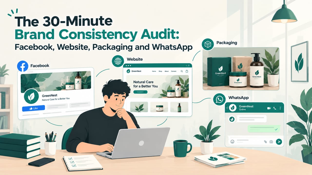
If you run a business that sells through a Facebook page, a WhatsApp number, a website and printed packaging, there is a good chance your customers meet a slightly different brand at each one. The logo on the box is an older version. The Facebook cover uses a green nobody chose on purpose. The WhatsApp profile still has last year's phone number in the description. None of these on its own looks like a problem. Together, they make a business look smaller and less certain than it is.
This guide is a brand consistency checklist you can run yourself in about half an hour. You collect every place your brand appears, score ten points from 0 to 2, and read the total. The score tells you which of three jobs you actually have: a few quick fixes, a set of written rules, or a new identity. In our experience the answer is usually one of the first two, and that is worth knowing before you spend money on the third.
Key takeaways
- Most brands that feel tired have a consistency problem, not a design problem. The same logo used the same way everywhere does more than a new one used carelessly.
- Audit the places your customers really see you: your Facebook page, Instagram, WhatsApp profile, website, packaging, shop front and printed material.
- Score ten points from 0 to 2. A high total means quick fixes, a middle total means you need written rules, and a low total means you need rules first and possibly an identity after.
- Only a failed logo check (unreadable at small sizes, no vector file, or no longer describing the business) is a reason to redesign.
- Consistency is kept by three things: a one-page rule sheet, ready-made templates, and one named person who signs off anything public.
Why consistency matters more than a new logo
Customers do not study your logo. They recognise you from repetition: the same colour on the same kind of post, the same voice in replies, the same box arriving at the door. Every time something looks a little different, that recognition has to start again. A business with a plain logo used the same way for three years usually looks more established than one with a beautiful logo used five different ways.
Inconsistency rarely comes from bad decisions. It comes from many small, sensible ones made by different people. A freelancer designs a sale banner and picks a font they like. A staff member updates the WhatsApp profile from their phone. The printer cannot find the vector file, so they trace the logo from a JPG. Each change is reasonable. Nobody ever sees them all together, which is exactly what this audit is for.
It is also why we say on our branding page that most businesses do not have a branding problem, they have a consistency problem. A redesign does not fix that. The new logo will drift in the same way as the old one unless the rules and habits around it change too.
Before you start: collect every touchpoint in one place
The audit only works if you look at everything side by side. Make one folder, or one slide, and spend the first ten minutes filling it. Use what customers actually see today, not the files you meant to use.
- Facebook page: a screenshot of the profile photo, cover, page name and About section, plus your last nine posts.
- Instagram and TikTok, if you use them: the profile and the latest grid.
- WhatsApp: your business profile as a customer sees it, with the photo, name, description, address, hours and catalogue, plus two or three of your standard replies.
- Website: the header and footer on a phone and on a laptop, and one product or service page.
- Packaging: photos of your boxes, bags, labels, stickers and any insert cards, as they look today.
- Physical places: shop sign, banners, staff uniforms or ID cards, delivery bike stickers.
- Documents: invoice, quotation, business card, letterhead and any PDF price list.
- Marketplace listings, if you sell on Daraz or similar: your store banner and one listing.
- Ads: the last two or three boosted posts or ads you ran.
Put the screenshots on one screen at the same size. Seeing a Facebook cover next to a delivery box next to an invoice is usually enough to spot half the problems before you score anything.
The brand consistency scorecard
Score each point 0, 1 or 2 across everything you collected, then add them up. Score strictly: if one important touchpoint is wrong, that point does not get a 2. The scorecard is our own working checklist, built from auditing brands in Bangladesh, not an industry standard, so treat a borderline total as a borderline answer.
- Logo use: is it a different version on different touchpoints, stretched or redrawn somewhere (0), the same logo but with inconsistent sizes, backgrounds or spacing (1), or the same file, used the same way, everywhere (2)?
- Colours: do the colours change from post to post and print to print (0), look roughly right but not exact (1), or match closely on screen and in print (2)?
- Typography: are there more than three unrelated fonts across your material (0), two or three with no clear rule for which goes where (1), or a set pair used the same way, including for Bangla text (2)?
- Photo style: do your product and lifestyle photos look like they come from different businesses (0), mostly match but with obvious outliers (1), or share the same light, background and framing (2)?
- Tone of voice: do captions, replies and ads swing between formal, casual and hard-sell (0), stay mostly in one voice with some exceptions (1), or sound like the same person everywhere, in Bangla and English (2)?
- Name, bio and contact details: do your business name, description, phone numbers, address and hours differ between Facebook, WhatsApp, Google and your website (0), differ in one place (1), or match exactly everywhere (2)?
- Prices and offers: are prices, delivery charges or sale terms stated differently on different channels (0), consistent but written in different ways (1), or the same figures in the same words everywhere (2)?
- Packaging: is the packaging unbranded or using an old identity (0), branded but not matching your online look (1), or clearly the same brand a customer saw on Facebook (2)?
- WhatsApp profile: is it a personal-looking profile, a blurry or cropped logo, or missing a description (0), complete but out of date in places (1), or complete, current and matching your other profiles (2)?
- Website header: on a phone, is the logo blurry, badly cropped or different from your social profiles (0), correct but crowded or off-colour (1), or sharp, correctly spaced and clearly the same brand (2)?
The maximum is 20. Write down the score for each point as well as the total: the low points tell you where to start.
Reading your score
16 to 20: quick fixes
Your brand is in good shape. The gaps are specific and you can probably close them in a week: replace the old logo on one sticker run, update the WhatsApp description, fix the blurry header file, align the delivery charges across channels. Do those, then run the audit again in six months, or whenever you add a new channel or a new person starts posting for you.
9 to 15: you need written rules
This is where most businesses land. The identity is fine, but nobody has written down how to use it, so everyone who touches it makes their own version. You do not need a new logo. You need a short set of brand guidelines covering the logo files and how to place them, exact colour values, fonts for each use, a few photo and layout examples, and how the brand sounds. Add templates for the things you make most often, such as posts, stories and price cards, and most of the drift stops.
0 to 8: rules first, then decide on the identity
A low score feels like a reason to rebrand, but it usually means the brand has never had a system, not that the logo is wrong. Run the logo check below. If the logo passes, start with guidelines and templates, as for a middle score, and audit again in three months. If it fails, plan an identity project, but build the rules in as part of it. Otherwise the new identity will score just as badly within a year.
The logo check: is the problem the logo itself?
Three questions decide whether a redesign is justified. If you answer yes to any of them, the logo is part of the problem and fixing consistency alone will not be enough.
- Does it fail at small sizes? Shrink it to the size of a WhatsApp profile photo or a browser tab. If it turns into a blur, or the text cannot be read, it will never work well in the places customers see it most.
- Do you have no proper file? If nobody can find a vector file (SVG, PDF or the designer's source file) and every use is traced or screenshotted, you will need the logo redrawn at minimum.
- Has the business outgrown it? If the logo describes one product you no longer focus on, a name you have changed, or a customer you no longer serve, consistency will only make the wrong message more visible.
If you do need a new identity, our guide to what a logo design quote in Bangladesh includes explains what to ask for, including the files and the transfer of rights that most cheap quotes leave out.
What a consistent brand looks like in practice
Consistency does not mean every post looks identical. It means every post is built from the same small set of parts. In our Morrow Coffee and Krypt concept brands, that set is short. Morrow is a deep forest green, a twin-peak monogram, an italic serif paired with a geometric sans, and one line: "Better days brew here." Krypt is grayscale photography, heavy textured display type, an angular wordmark and a single brush stroke of green kept back for the moments that should hit hardest.
Both brands can produce a launch post, a price card or a story without anyone inventing a new layout, and each is recognisable with the logo covered. That is a useful test for your own audit: hide the logo on five pieces and ask someone whether they can tell they all come from the same business.
The Krypt green also shows why rules matter. Its power comes from being rare. If one designer starts using it on every post, it stops working, and nothing in the logo itself would stop them. Only a written rule does. Our own brand identity is documented the same way, down to clear space measured from the logo's stem width and a single accent colour reserved for dark backgrounds, because a rule people can look up is easier to keep than one they have to remember.
A brand stays consistent when the next person to make something can get it right without asking anyone.
The three fixes that usually come first
Whatever your score, these three changes do most of the work. They are cheap compared with a redesign, and they are what keeps a new identity consistent if you do get one.
1. Write the rules down
Start with one page, not a thirty-page manual. A page that is used beats a manual nobody opens. The next section lists what goes on it.
2. Make templates for what you produce most
Look at the last month of posts and material. The pieces you make again and again, such as product posts, sale announcements, story frames, price cards, invoices and delivery stickers, should each have a template with the logo, colours and fonts already in place. Templates remove the decisions where drift starts, and they make freelancers and new staff faster as well as more consistent.
3. Give the brand one owner
Name one person who checks anything public before it goes out: posts, ads, packaging reprints, signboards and profile changes. In a small business this is often the owner. The check takes a minute against the rule sheet, and it catches most of what the audit finds before it happens. When you hire a freelancer or an agency, send them the rule sheet and the templates on day one, and make the same person their point of contact.
What goes on a one-page brand rule sheet
- Logo: links to the correct files, which version to use on light and dark backgrounds, the minimum size and the clear space around it.
- Colours: exact values for screen (HEX) and print (CMYK), and which colour is for backgrounds, text and highlights.
- Fonts: one for headings and one for body text, with the Bangla pairing if you use Bangla, and a note on where each font's licence is kept.
- Photos: two or three example images showing the light, background and framing you want, and one showing what to avoid.
- Voice: three words that describe how you sound, a sample reply in Bangla and in English, and words or phrases you never use.
- Fixed details: the exact business name, phone numbers, address, hours, delivery charges and the standard description for every profile.
- Owner: the name of the person who approves anything public.
Keep it somewhere everyone can open from a phone, such as a shared folder or a pinned message in your team group, and update it when anything on it changes.
Frequently asked questions about brand consistency
Do I need a rebrand?
Only if the logo check fails or your business has changed what it is. If customers already recognise your logo and it works at small sizes, a rebrand throws that recognition away. Fixing how the current identity is used is cheaper and usually has more visible effect.
What should be exactly the same everywhere?
The logo file, the colour values, the business name and contact details, and your prices and delivery terms. These are the things customers notice when they differ, and the things that make a business look careless. Layouts, photos and captions can vary, as long as they are built from the same parts.
How do I keep freelancers and agencies on-brand?
Give them the rule sheet, the templates and the original logo files at the start, and route their work through one person who approves it. Most off-brand work from outside designers comes from not having the files, not from ignoring them.
Should my Bangla and English material look the same?
It should look like the same brand. That means a Bangla font chosen to sit comfortably next to your Latin font, the same colours and layouts, and the same tone in both languages. A brand that looks polished in English and improvised in Bangla tells Bangla-speaking customers they matter less.
How often should I run the audit?
Every six months, and whenever something changes: a new channel, a new packaging run, a new staff member or agency posting for you, or a big seasonal campaign such as Eid.
Score first, then decide what to fix
The audit takes half an hour and turns a vague feeling that the brand looks off into a list of specific problems with a clear order. For most businesses, the result is not a new logo. It is a page of rules, a handful of templates and one person who checks them.
We help businesses with all three, and with full logo and brand identity projects when the logo check says it is time. If you have run the audit, send us your score and your screenshots and we will reply with the first three fixes we would make. You can also see how we approach branding and marketing as one system, from positioning to campaigns.